12 creative ways to use an AI background remover for catchy ads (+ real-life examples)
5.45 billion internet users, 193 million active websites, 2.71 billion online shoppers, and tens of social media platforms, with at least half a billion active users on 15 of them.
These are the numbers to navigate before reaching customers in our modern world. It’s scary for a second when you think about it. But then, you remember that there’s one tried and true way to get through the crowd and reach your audience: creating targeted online ads.
A well-positioned ad campaign can help your business generate, nurture, and convert leads from the ocean of potential customers on the internet. Several businesses know this, which is why 70% of all advertising money worldwide is spent on digital ads directed at specific prospects and channels.
But wait: knowing the right target audience and platform is one thing, but creating an effective ad is another. Ad designs can be time-consuming and expensive, considering that you have to tailor your designs to different channels. So, what’s the easiest and most cost-effective way to create multiple ads that work wonders?
Well, turns out that using an AI background remover makes it easy to create scroll-stopping ads for different platforms (without breaking the bank). I’ll share ways this simple design tool can elevate your ad designs, with real ad examples and excellent design tips for crafting winning ads.
Everything you’ll learn
Why small businesses need AI background removers to create ads
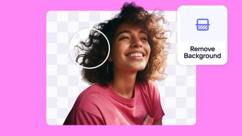
Businesses use AI background removers all the time to erase backgrounds from images. These tools use advanced algorithms to identify and remove backgrounds while preserving the main details of any picture. AI technology is a total game-changer in the photo editing landscape. It simplifies part of the design process, making it easy for anyone without technical skills to create stunning visuals.
Small business owners that include an AI background remover tool in their ad creation process get to:
Save time: AI-powered background removers work their magic in seconds. A reliable image editor can even batch-remove background from pictures automatically. With this, any business can easily streamline its editing workflow and prepare large volumes of content for advertising, without sacrificing quality or consistency. It's super beneficial if your business requires quick turnaround times for graphic design projects.
Reduce costs: Hiring professional photo editors or graphic designers can quickly add up, especially if you're running multiple campaigns. An AI background remover eliminates the need for these extra expenses by providing high-quality results at a fraction of the cost.
Remove distractions: A picture is worth a thousand words, and this is even truer in advertising. By removing unwanted backgrounds, you focus the viewer's attention on the key elements of your ad—be it a product, a person, or a call to action. Clean images can grab attention and improve your ad's effectiveness.
Create multiple ads: Using an AI background remover lets you place your product or subject into any theme that fits your creative vision. With this flexibility, you can explore new creative directions, adapt your visuals to target different audiences, and turn a single image into countless unique ads without needing multiple photoshoots.
📘 Don’t miss: How to remove the background from an image on an iPhone
12 creative ways to use AI background remover for ads
After making a transparent background for your image, here are excellent ways to create professional ads with your background-free photos.
1. Showcase your product in different settings
There are several product photography ideas out there. But nothing says, “My product has range,” like the same product displayed in various settings. This adds variety to your ads and helps customers visualize how and where they might use your product.
If you’re thinking: won’t this stretch my ad budget? Well, only if you let it. You can stay lean by joining other smart business owners using AI to create realistic image backgrounds and beautify e-commerce product photos.
AI background image generators are great at picking up on context, and Chai, Founder of Chai Creations, agrees. When she wanted to present her work professionally online, she opted for a background image generator and has stuck with it for its context awareness.
"What always fascinates me is no matter what orientation I take the picture in, the AI Backgrounds tool in Photoroom sort of picks it up so that my art is not floating in the air or some awkward position,” she says. “It's like if I stack my cups or if they're taken lying on the ground, the [tool] can somehow make it make sense as if I brought the piece to the actual place to take the photos."
Ford’s "Anywhere, Anytime" campaign is a good example of communicating product diversity. The ad displays the F-150 Raptor in various rugged environments, highlighting the truck’s versatility and power. This way, you can easily imagine how it performs no matter where you take it.

📘 Catch up: How to add a background to a photo online
2. Create dynamic social media campaigns
Standing out on social media has never been more important. Social commerce is growing fast, with more people shopping from their phones and becoming interested in connecting directly with small businesses.
You can grab attention with your social posts by using elements that make your ads compelling and shareable. Try putting your products in fun, unexpected settings—like a coffee mug on a miniature construction site—or combining creative elements, like a sneaker bursting with flowers, to create ads that pop in this competitive space.
These food ads from Niryas and Cremica are great examples of dynamic social media campaigns. Niryas takes their full cream milk and adds a fun twist, showing it kicking a punching bag to emphasize the energy boost it offers. It's simple, yet it grabs attention with playful design elements.
On the other hand, Cremica turns their digestive biscuits into a pair of glasses, cleverly tying it into Gandhi Jayanti. It’s a creative way to blend culture with product, making the ad both shareable and relevant to the moment.

3. Customize ads for different audiences
One message doesn't fit all, especially when it comes to advertising. Tailor your ads to resonate with different demographic groups by placing your product in settings that speak directly to them. For example, if you're marketing a backpack, you can place it on a trail with hiking gear for outdoor lovers, in a bustling airport for travelers, or filled with books and gadgets for students.
Personalization lets you speak directly to each audience's lifestyle and aspirations, showing that you understand and value your customers' unique preferences.
Here’s an example of how Fitbit customized an ad to reach different audiences. The brand used a split-screen ad design to display its smartwatches, speaking to both fitness enthusiasts and style-conscious individuals.

4. Make your sales event ads festive
Who doesn't love a good discount? You can spruce up your sales campaigns by adding thematic backgrounds or design elements that match the theme.
Hosting a summer sale? Place your transparent product photo against a sunny beach backdrop with swaying palm trees. Planning a Halloween event? Add some spooky elements around your product, like pumpkins and cobwebs. Descriptive backgrounds make for a more eye-catching visual and get people in the mood for your event.
The meat delivery startup, Dr. Meat, nails it with this creative ad for Halloween. The brand immediately sets a spooky atmosphere with a large knife dramatically plunged into a roasted chicken, with bold, eerie text, tying Halloween’s spookiness with the idea of a delicious meal made with their product.

5. Show before/after transformations
No industry does this better than the beauty industry. If you search, “before and after ads” on the internet, you’ll likely find ad creatives depicting weight loss transformations, acne corrections, or the journey from yellowing to white teeth. Businesses in this sector understand that people are naturally drawn to transformation stories—they're relatable, fascinating, and moving enough to inspire action.
Removing backgrounds allows you to focus squarely on the transformation without distracting elements. So, take a leaf out of the beauty industry’s playbook and use before-and-after images to highlight the impact of your product or service in your ads.
If you run a food business, you can display a full plate of your product on one side and an emptied plate on the other, paired with a compelling copy. If you sell cleaning products, you can show the transformation of surfaces with a transparent image of your product attached. This ad format offers endless possibilities.
Here’s a playful take on the classic before-and-after transformation from Oreo. The simple sketch shows a cookie on one side and the joy of biting into it on the other. With just two clutter-free visuals, the brand captures the instant gratification that comes with every bite, making the transformation from an untouched cookie to a satisfied smile relatable.

6. Quickly update seasonal ads
Seasons change, and so should your ads. With a transparent image, you can swiftly swap out backgrounds from portraits or product shots to match the current season or holiday without needing a reshoot. This keeps your marketing materials fresh and relevant, ensuring you always connect with your audience.
To simplify this design process, it’s worth using a photo editor that provides ad templates for different seasons. You can take advantage of countless unique templates in the Photoroom app to save time and maintain a consistent brand aesthetic.
Here’s how Cavin’s smartly curates seasonal ads using their products. For the holidays, they stack milkshake packs into a festive tower shaped like a Christmas tree. For World Chocolate Day, they place a background-free photo of their chocolate milkshake in a creamy chocolate-colored background. Both are creative plays on speaking seasonal languages.

7. Improve A/B testing
Not sure which background will resonate best with your audience? Test them! Create multiple versions of your ad with different photo backgrounds and run A/B tests to see which one performs better.
Maybe your audience responds more to minimalist designs than busy backgrounds. Testing different types of images allows you to optimize your campaigns based on real data, so you get the best return on your investment.
Corona’s "For Every Slice of Sun" campaign is a great inspiration for A/B testing. By simply changing the background from sandy beaches to rocky cliffs, they highlight how different visuals can evoke unique feelings, even with the same product front and center.

8. Simplify user-generated content
User-generated content (also known as UGC) makes up a huge chunk of the internet, especially social media. 85% of people even say that UGC is more influential than photos curated by brands, which makes sense since people trust reviews and UGCs are effective forms of review.
When working with customers or content creators for UGC content, remove the background from your logo or product images and provide them with these transparent brand assets. This way, it’s easier for them to create their own ads, share how they use your product in their creative scenes, and make authentic, standout content that you can use for ads across your platforms (at little to no cost to you).
Miranda Sanchez, a fashion creator in New York City, knows all about using transparent product images to make exciting visual content for brands. She shows how to make video transitions of products using the Photoroom editor and her imagination on Instagram.

9. Create an ad series for a single product
Why tell a story in one frame when you can create a whole series? Erasing image backgrounds gives you the freedom to use new backgrounds and craft a narrative that progresses with each ad while keeping the focus on your product.
You can take inspiration from the viral Google Pixel #BestPhonesForever video campaigns, which displayed a friendly competition between the Pixel and iPhone. The ad features their phones in various real-life scenarios, each spotlighting a stand-out feature in an adorable way.
You don’t have to make videos to bring a similar vision to life though. The goal is to create an experience that keeps your audience engaged and eager to explore your product.
10. Educate customers about your product
Sometimes, a product has so much to offer that it needs a bit more explanation. Turn your product image into a dynamic infographic by removing the background, changing it to a white background color or a different solid color, and adding informative elements.
Highlight different features, show internal components, or illustrate how it solves a specific problem. This educational approach demonstrates value, which can build trust and make your product more appealing to potential customers.
Vaseline’s ads are a perfect example of educating customers in a clear, relatable way. They place the Vaseline jelly in both visual presentations, highlighting key benefits in the first and showing a powerful before-and-after comparison with a treated and untreated leaf in the second to demonstrate the product's moisturizing power.

11. Elevate video ad content
Of the 5.45 billion people who use the internet, 3 billion of them watch digital videos. That’s a staggering number. But it’s also reasonable because the human eye is drawn to motion, and we connect better through narratives, both of which are core elements of videos.
With social platforms prioritizing video content, your video ad is more likely to reach a wide audience if it strikes engagement and improves retention. Having background-free images opens the door to creating this type of experience.
Whether it’s a 15-second social media clip or a longer YouTube video, you can weave your transparent photos into various scenes to show the benefits of your product or service. You can layer your products over visual testimonials, spotlight them with special effects, or use them for animated explainers to tell a compelling visual story that keeps viewers hooked from start to finish.
Crafted Ideas captures this beautifully in their "Soap Me Up" campaign. The ad shows their soap pills in visually engaging backgrounds that tell a clear story and instantly draw you in.
12. Showcase product catalogs
When you remove distracting backgrounds and use a consistent look for each product, you can turn photos taken in different places—like your kitchen or backyard—into polished designs for product catalogs. This helps customers focus on your craftsmanship, materials, and product design rather than the clutter around your product.
This consistency is another big reason Chai uses the AI background remover and other tools in her editing process. “I might make pieces at different time points or photograph them in different places, so it can look very messy,” she says. “If I want pieces with the same theme or part of the same series to have a plain pastel background, the AI Backgrounds and background color palettes are an easy way to do it.”
A well-designed catalog makes shopping easier and more enjoyable for your customers, which can lead to more sales and a stronger brand image, even for small businesses like yours. I recommend using a bulk background removal feature to process images for your catalog and save time.
Here’s how the outdoor clothing brand, Patagonia, nails showing off their jackets in their catalog. With the clean, consistent backgrounds, your eyes are drawn straight to the details—the sleek zippers, the perfect stitching, the cozy fabric. No clutter, no distractions, just pure professional presentation.

Small business advertising tips for powerful ad designs
Creating an impactful ad is more than throwing together images and text. It’s about crafting an experience that resonates with your audience. A great ad has eye-catching visuals, clear messaging, and a compelling call to action. If your ad is missing any of these, it’s likely to fall flat.
To help your ads stand out, here are six tips for designing ads that connect and convert.
1. Connect with stories
Studies have found that emotional ads drive people to buy products. The surest way to a person's emotion is through storytelling. Stories evoke strong feelings. They create a connection that builds trust, which is one of the main factors that makes people purchase products.
Define your audience clearly, understand their needs, and infuse compelling storytelling with designs that show customers you understand their struggles.
You can also tell compelling stories by replacing words with stunning visuals, which is something Heinz does well in their ad by stacking up slices of fresh tomatoes to communicate a healthy product and depict a bottle of Heinz ketchup.

2. Keep ads simple
Simplicity is the secret sauce behind most successful ad designs. Your audience shouldn’t have to struggle to understand your message. Stick to clear, readable copy and well-organized graphic elements.
It’s easy to keep ad designs simple when you know what problem your product solves. This type of clarity allows you to cut out unnecessary details, focus only on the key message, and make the solution clear and straightforward for your audience.
So, ask yourself: What are my customers’ pain points? How can my product’s features help solve their problems? Make that the centerpiece of your ad, and let everything else flow from there.

3. Use clear CTAs
A call to action (CTA) guides your audience to the next step in their journey with your brand. Don’t leave them guessing what to do next—tell them, but do it concisely. A single, clear CTA is all you need to give your ad a direction. Whether it’s “Shop Now,” “Learn More,” or “Sign Up,” keep it short and sweet.

4. Use elements unique to your audience
To create ads that truly resonate, tailor them to your audience’s specific world. If you’re targeting freelancers on Upwork, for instance, consider using a screenshot showing growth on Upwork’s platform. It’s familiar, it’s relevant, and it instantly catches their attention because it’s something they relate to. The more you speak your audience’s language—visually and verbally—the more effective your ad will be.

5. Understand how platforms work
Not all platforms are created equal, and your ad design should reflect that. Each digital marketing platform has its vibe, dimensions, and best practices. Use the right size for your visuals and adapt your message to fit the platform’s tone. For example, what works on Instagram might need a tweak for YouTube. Understanding how people behave on different platforms helps you create ads that meet them where they are, boosting your chances of engagement.

6. Leverage templates
If you’re short on time or design skills, templates can be a lifesaver. Great photo editing platforms offer pre-made ad design templates that you can customize to fit your brand. These adaptable templates are a great way to maintain consistency across your ads while still being able to crank them out quickly. Plus, they’re designed by pros who understand what works—so you can focus more on the message than the layout.

Go beyond digital ads with AI background removers
AI background removers aren't just for online ads. They open up creative possibilities for your offline marketing as well. With a clean, background-free product photo, you can easily repurpose your images for print materials like branded merchandise, customized business cards, and even posters or flyers for in-person events.
The magic is in the details, and accurate background removal ensures your images look sharp and professional, whether you're creating digital design assets or tangible materials. Platforms like Photoroom take it a step further, offering an intuitive, user-friendly experience even those with zero design experience can master.
You can use the web version or mobile app (iOS or Android) to remove backgrounds in bulk and get effective image processing every single time. You can also collaborate with your team and save time on feedback while keeping your visuals on point. It’s a scalable way to expand your marketing toolkit without needing a full-blown design team.
AI background remover FAQs
What is the best AI tool for background removal?
Photoroom's Remove Background tool is one of the most advanced tools for background removal. It's easy to use and quickly removes backgrounds from photos, making them look clean and professional without much effort. You can get rid of black backgrounds or other unwanted backgrounds from portraits and other shots.
How does background removal help in ad creation?
Background removal makes your ads stand out by focusing viewers' attention on the main product or message. Without distractions in the background, your product looks more polished and catches the eyes of potential customers. This is especially useful for creating clean, professional-grade visuals that work well for digital marketing and print materials.
Can I use a free background remover for multiple platforms like Instagram and Facebook?
Yes, you can use a free photo background remover app to make image background transparent for platforms like Instagram and Facebook. After editing your images, you can save them and upload the same photos to different platforms without any issues. It’s a simple way to create high-quality content that looks good across various marketing streams.
📚 Related reading


